NAT GEO UPFRONTS
National Geographic Channel
Concept, Art Direction, Design, Edit
Loyalkaspar
The 2016 Upfronts were an incredible opportunity to help Nat Geo in an exciting new period in their network's history. With an eye towards launching cinematic and premium original programming, we sought to enhance the brand with a package that embodied the legacy of the National Geographic with an approach befitting to their goals of opening up the brand to a new chapter.
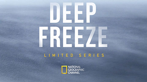
Deep Freeze
We started with developing a grid based on the Nat Geo frame.
Breakthrough
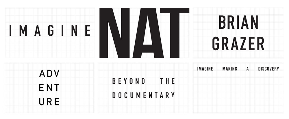
The grid served as the backbone for all typographic decisions.
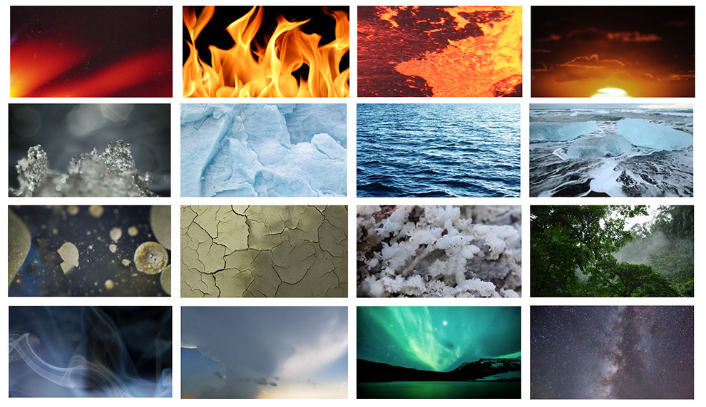
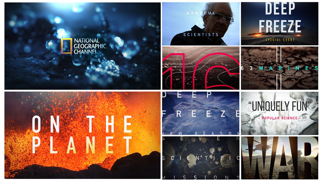
For all our graphic backplates we looked to Fire, Water, Earth and Air as the visual foundation.
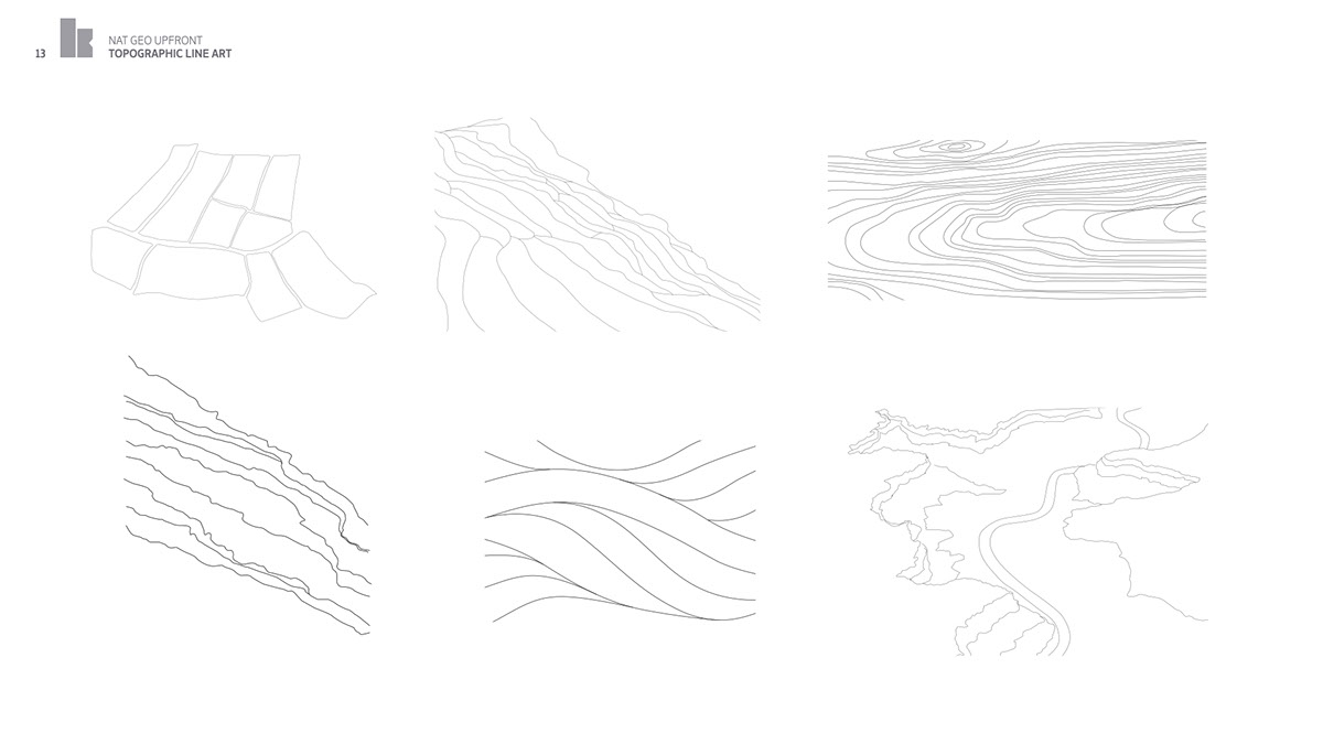
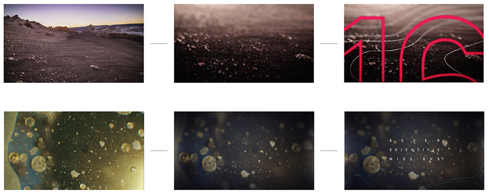
From there we accompanied the photographic elements with line art inspired by nature.
A process of how we merged the elements together
.jpg?crc=4148222797)

The graphics were used in combination with the elemental backplates and with show footage, The best part of working with National Geographic is the beauty of their image library.
Backplates were approached in two ways, micro and bold and macro and elegant.
The logo was treated in a sophisticated manner, adding enough dimension and effect
to enhance the premium nature of the brand.
Egypt Revealed
Egypt Revealed
Last Men Out Animatic