FENWAY PARK CENTENNIAL
Boston Red Sox
Creative Direction, Design
Self / FBF NY
Logo

Fenway Park became the first professional North American sports venue to reach it's 100 year anniversary. Our New York team had the honor to roll out almost every aspect of this historic occasion beginning with the logo.
When designing the Fenway Park 100-year anniversary logo, there needed to be a connection built between the historical and the contemporary aspects of Fenway.
This entailed an approach that would not only embody many of Fenway’s historical
and present visual qualities, but one that would befit the anniversary celebration and connect with the fan base in an honest and meaningful way.
The keystone geometry and rooftop is derived from the original 1912 façade that still sits above Fenway's Gate A main entrance. The keystone serves as a metaphor which speaks to the relationship between Fenway and the Red Sox. The fonts in the logo are pulled from type which is native to the ballpark. Finally, The “100 YEARS” backplate was designed to resemble the iconic Green Monster.
Tickets

The design of Fenway Park’s centennial tickets relied heavily on research. There was a careful topology done of every ticket design from the Fenway archives and we used these tickets as the foundation for our work. The final design conformed to the simplicity of Fenway as it has remained throughout its history.
The design utilizes an antique black and white photograph of the park’s façade taken during its inaugural season. We aimed to strike a chord of recognition in Red Sox fans and ticket holders through the integration of familiar elements both from Fenway’s
past, and present.
Along with the game tickets, boxes which adorned stubs from significant games draped along the surface were also designed as well as commemorative tickets given away at Fenway's 100th anniversary game April 20th 2012 versus the New York Yankees.


Tours

To accompany tours, a map was created that serves as a key to important and historic locations and objects displayed throughout the ballpark. The design incorporates the Green Monster scoreboard number plates overlaid on architectural drawings of Fenway.
A book was also designed to accompany Fenway Park tours. The aim was to create a book that would highlight the history of the ballpark and give an insiders perspective.
Tourbooks could be referenced during the tours as a source of historical facts and statistics. While old archival photographs cover the pages, the book remains contemporary both in feel and design, suggesting that what is contained within is a modern retelling of an old story. The design utilizes the color palette of Fenway Park as well as the Red Sox and again draws inspiration from the various attributes and signature quirks of the ballpark.

Tour Book


City Banners

There was a two-part approach to the content for the city banners. The first involved the use of insider parts of Fenway Park through the use of evocative images. These intimate images were meant to inspire anticipation while walking towards the ballpark.

The second concept for the banners was to present a series of historical moments and players. The understated nature of the design approach allowed the images to resonate at greater volumes to one of the most knowledgeable fan bases in the world.
LED Boards
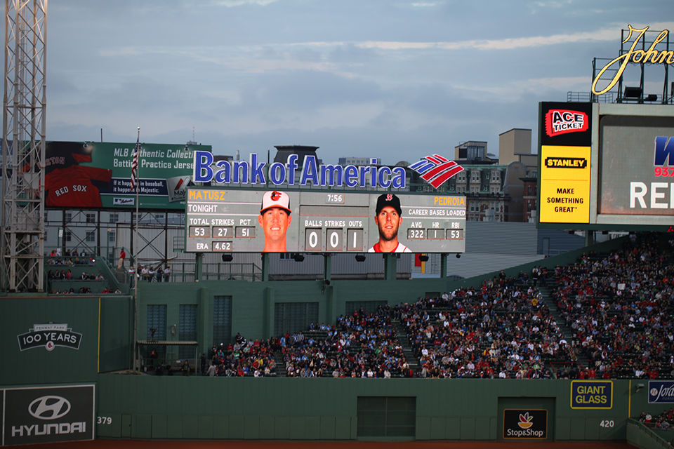
We approached the design of Fenway Park’s LED Boards with a two-part solution. We aimed first to use Fenway Park as a source of information for our design. We found inspiration in specific attributes of the park, from the Green Monster scoreboard to specific symbols, typography and geometry taken from various signage around the park.
Additionally, we trained the Red Sox in-house design team to approach their process in a new way; we trained the design team to look at platforms and design approach in a new way, and in expanding our client’s skill set, ensured our enduring value.


On-Air
Fenway's sports channel NESN produced a series of documentaries and specials to celebrate the the anniversary. In coordination with the themes we had been dealing with throughout the brand we created an archival slide show system to be used as a title sequence and graphics package.


On-Air


'The Nation's Archives' is the name of the Red Sox artifacts that were, until recently, tucked away in storage. For the 2012 season the team decided to open their vault up and display the memorabilia as part of a premium bar/club called 'The Nation's Archives'. We designed the logo for the club as well as some of the signage within.